The idea behind this thread is pretty simple, want to create a Community-Formed (so it isn't just me dropping in with tips) Guide for new members who want to create their own builds. Basically, anything from links, individual tips, site-formatting pointers, anything that you think could be helpful to a new member who's just posting their first build.
As an extra little note, before I let everyone leave their tips, I did want to add that I'd really love to hear from people who have just started building or are thinking about starting. There are a lot of things that I just won't think of, and others who have been building for years won't think of because well, a lot of stuff is just second nature at this point. So if you have any questions about why things are done certain ways, or just want to know the answer to something then feel free to ask, in fact, I encourage it :D
Builds to Read
Character Building Hall of Fame and Modern Masters - 2016 Winners contain what the community considered the best builds released from 2016 and earlier. Each build that made it into one of these archives is considered an excellent build by the site at the time, and should be examined for anyone looking for inspiration, or a goal to beat.
Formatting
Before even beginning to learn the exact ways to format your build, it's good to get an understanding of what you'd like your build to look like. Unless you're some sort of Art Wizard, the best bet is to examine a few different styles of builds to see certain styles and how they work, and imitate it (with your own personal touches).
Here are three builds that use fairly simple designs to great effects. All three were mentioned by Flamezsword
- The Elder One by Oddball is more of a center-style picture build using white picture backgrounds to 'blend' into the page removing hard edges, but still standing out. A great style for Beginners!
- KingSlayer by Mason presents in both center and side pictures. Mostly builders will use small pictures for the 'special abilities' or 'alchemy' sections. As shown here. Another interesting way to present a build.
- The Stormlord by TED which uses pictures with small borders to make the main pictures 'pop,' while the side images break up longer paragraphs of text.
Pictures
Always add a few pictures to your build that can help give the reader a better understanding of who your character is. This also can help break up text so the build looks less blocky, and is always a great thing to add to a build.
Pictures can be added either from your PC or from the internet, but can't be added in from mobile. You can add them from your PC by uploading them with the 'Upload an Image' button, which says upload. And you can add them from any other site or google images by using the 'Insert/Edit Image' button located to the left of the Upload Image button.
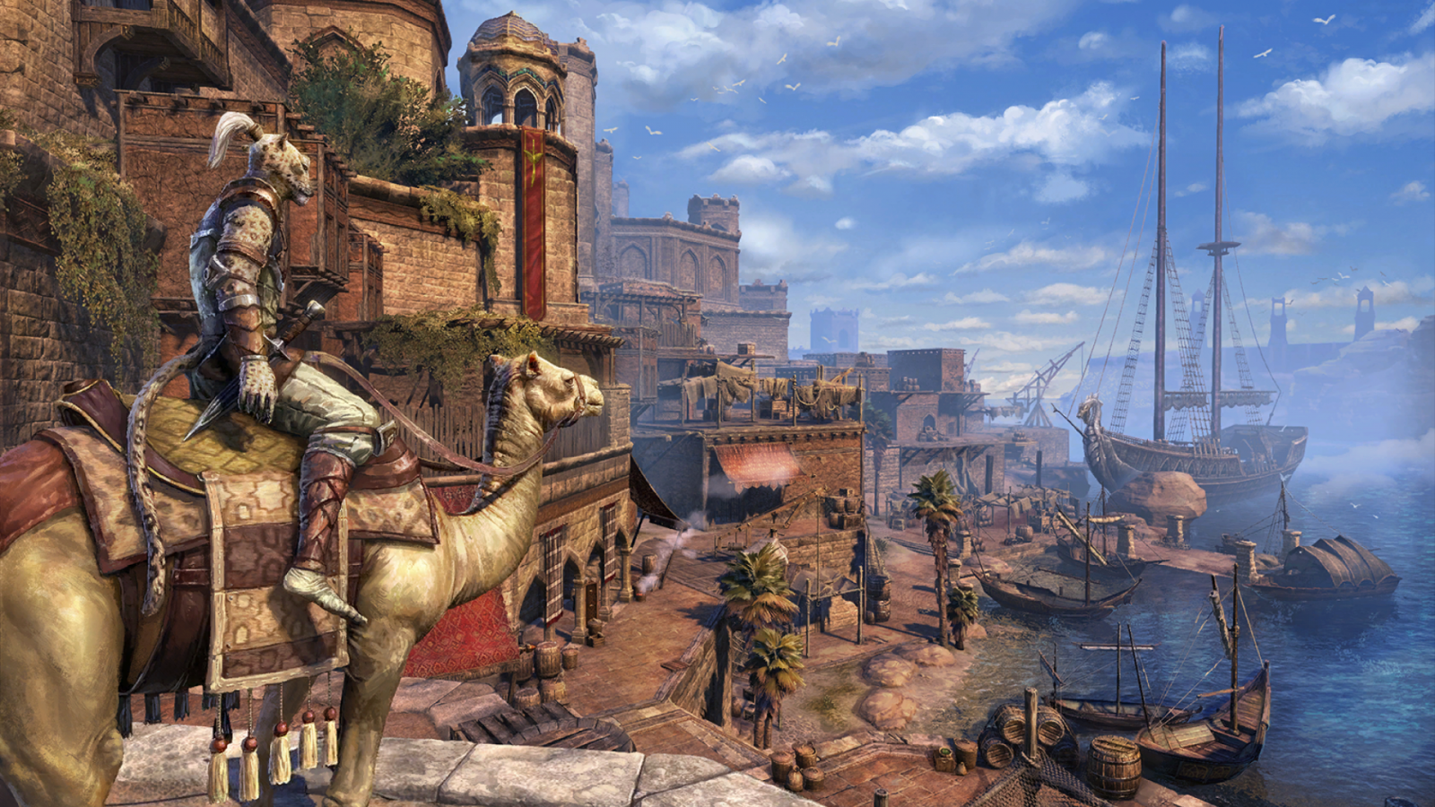
Pictures don't have to be screenshots, in fact a lot of builds use art from other games, anime, tv shows, even real works of art or hand-drawn works. That said, screenshots are cool too.
For artwork (that aren't screenshots), I'd recommend using Pinterest, DeviantArt and Google Searches of particular keywords to find what your looking for. As an example, looking up something like 'Fantasy Barbarian Artwork' can get you some really great images that would fit your build. Elder Scrolls Legends has also introduced an absolute tonne of 'in-universe' artwork that I'd recommend looking at and possibly using.
We do have a Screenshots Request Thread, though (as of writing this) it isn't incredibly active. You can also find some really cool images in mods, especially if your using specific armour combinations. For example, checking out Amidianborn Bonemold Armor provides some really cool screenshots for any Bonemold wearing characters (though I would recommend providing a link at the bottom of either the image, or the build to give credit to the modder).
Our Art Group Requests Thread can help set you up with some really useful tools for builds, roleplaying profiles or anything else. Things like Perk Spreads (a list of your perks presented artistically), an Equipment Spread (same as a Perk Spread) or Banners can be created by our talented artists to give your build an extra level of individualality.
I'd recommend adding in images that are wider, rather than thin but tall images. Generally speaking, it's a little harder to fit images with good text-wrapping when compared to having 'text - image - text'. And most of the time, something that's wider than it is tall can work a lot better in this situation.
The exception to this, is using smaller images. Basically the smaller your image the easier it is to get the text wrapping to work properly, but it can also cause some issues if you aren't careful.
Images uploaded directly to the site are often smaller than inserting them into your build (using the Insert/Edit Image button). Because of this, it can be a lot more useful to upload an image to an album on-site, or something like Pinterest, and then copy the URL into your build through the Insert/Edit button, because this will allow you to manipulate the size upto 900 pixels.
When aligning pictures, it's the picture alignment that really matters, and not just the text alignment. It's worth aligning them separately rather than just aligning everything to the left/right/center.
If you know in advance where you're going to be putting the pictures, it may be worthwhile to leave a 10 pixel or so transparent border along one of the picture's edges (the one next to the text), so that there's a smal gap between the picture and the text itself.
Basic Formatting
If you don't have the time to finish a build in a single day, or are up late, you can always copy and paste the source code of your build in Word/Google Docs/Notes to save all of your formatting. This can be done by clicking the 'source code' button which is located just above the 'Font Sizes' button and looks like this <>
When trying to text wrap images (have text and images displayed side by side) just note that it can be really tricky to get exactly right. The best method (that I've found) is to make sure that when your posting/uploading an image, make sure that it isn't aligned. By this I mean, make sure that it isn't automatically aligned to either left, right or center in the toolbar (indicated by the associated button darken). If you do that, leave it then type your text below you can then head up and align the image to either the left or right, and get at least a decently set up image and text.
Other people have different methods, including using Source Code, using any sort of image editing software (this can include Power Point by the way) to create a text box beside an image, essentially allowing you to turn it into an image made up of a picture and text. Those methods are more specific and can be a little tricky to blend in with the rest of the build, but still work better in general.
Make ample use of Bold, Italics and even Underlined text in your build. Out of the three, bold text can be used incredibly effectively just like it's been used in this discussion, to instantly draw attention to the section titles, and give your builda very simplistic way to break up text without constantly throwing in images. Underlined text, mostly works with bold text to give a little extra 'oomph' to a title/section header, and is something I prefer to use with sub-titles/text aligned to the left but still larger than the main body.
Don't use the coloured text to a massive degree. It's definitely fine (and sometimes awesome) to use some of the darker colours in moderation, but if you ever have a situation where more than a single sentence is coloured differently, I highly recommend rethinking your use of the colours. The lighter colours are also really difficult to see, so I'd recommend focusing on the darker colours.
The idea behind this thread is pretty simple, want to create a Community-Formed (so it isn't just me dropping in with tips) Guide for new members who want to create their own builds. Basically, anything from links, individual tips, site-formatting pointers, anything that you think could be helpful to a new member who's just posting their first build.
As an extra little note, before I let everyone leave their tips, I did want to add that I'd really love to hear from people who have just started building or are thinking about starting. There are a lot of things that I just won't think of, and others who have been building for years won't think of because well, a lot of stuff is just second nature at this point. So if you have any questions about why things are done certain ways, or just want to know the answer to something then feel free to ask, in fact, I encourage it :D
Builds to Read
Character Building Hall of Fame and Modern Masters - 2016 Winners contain what the community considered the best builds released from 2016 and earlier. Each build that made it into one of these archives is considered an excellent build by the site at the time, and should be examined for anyone looking for inspiration, or a goal to beat.
Formatting
Before even beginning to learn the exact ways to format your build, it's good to get an understanding of what you'd like your build to look like. Unless you're some sort of Art Wizard, the best bet is to examine a few different styles of builds to see certain styles and how they work, and imitate it (with your own personal touches).
Here are three builds that use fairly simple designs to great effects. All three were mentioned by Flamezsword
- The Elder One by Oddball is more of a center-style picture build using white picture backgrounds to 'blend' into the page removing hard edges, but still standing out. A great style for Beginners!
- KingSlayer by Mason presents in both center and side pictures. Mostly builders will use small pictures for the 'special abilities' or 'alchemy' sections. As shown here. Another interesting way to present a build.
- The Stormlord by TED which uses pictures with small borders to make the main pictures 'pop,' while the side images break up longer paragraphs of text.
Pictures
Always add a few pictures to your build that can help give the reader a better understanding of who your character is. This also can help break up text so the build looks less blocky, and is always a great thing to add to a build.
Pictures can be added either from your PC or from the internet, but can't be added in from mobile. You can add them from your PC by uploading them with the 'Upload an Image' button, which says upload. And you can add them from any other site or google images by using the 'Insert/Edit Image' button located to the left of the Upload Image button.
Pictures don't have to be screenshots, in fact a lot of builds use art from other games, anime, tv shows, even real works of art or hand-drawn works. That said, screenshots are cool too.
For artwork (that aren't screenshots), I'd recommend using Pinterest, DeviantArt and Google Searches of particular keywords to find what your looking for. As an example, looking up something like 'Fantasy Barbarian Artwork' can get you some really great images that would fit your build. Elder Scrolls Legends has also introduced an absolute tonne of 'in-universe' artwork that I'd recommend looking at and possibly using.
We do have a Screenshots Request Thread, though (as of writing this) it isn't incredibly active. You can also find some really cool images in mods, especially if your using specific armour combinations. For example, checking out Amidianborn Bonemold Armor provides some really cool screenshots for any Bonemold wearing characters (though I would recommend providing a link at the bottom of either the image, or the build to give credit to the modder).
Our Art Group Requests Thread can help set you up with some really useful tools for builds, roleplaying profiles or anything else. Things like Perk Spreads (a list of your perks presented artistically), an Equipment Spread (same as a Perk Spread) or Banners can be created by our talented artists to give your build an extra level of individualality.
I'd recommend adding in images that are wider, rather than thin but tall images. Generally speaking, it's a little harder to fit images with good text-wrapping when compared to having 'text - image - text'. And most of the time, something that's wider than it is tall can work a lot better in this situation.
The exception to this, is using smaller images. Basically the smaller your image the easier it is to get the text wrapping to work properly, but it can also cause some issues if you aren't careful.
Images uploaded directly to the site are often smaller than inserting them into your build (using the Insert/Edit Image button). Because of this, it can be a lot more useful to upload an image to an album on-site, or something like Pinterest, and then copy the URL into your build through the Insert/Edit button, because this will allow you to manipulate the size upto 900 pixels.
When aligning pictures, it's the picture alignment that really matters, and not just the text alignment. It's worth aligning them separately rather than just aligning everything to the left/right/center.
If you know in advance where you're going to be putting the pictures, it may be worthwhile to leave a 10 pixel or so transparent border along one of the picture's edges (the one next to the text), so that there's a smal gap between the picture and the text itself.
Basic Formatting
If you don't have the time to finish a build in a single day, or are up late, you can always copy and paste the source code of your build in Word/Google Docs/Notes to save all of your formatting. This can be done by clicking the 'source code' button which is located just above the 'Font Sizes' button and looks like this <>
When trying to text wrap images (have text and images displayed side by side) just note that it can be really tricky to get exactly right. The best method (that I've found) is to make sure that when your posting/uploading an image, make sure that it isn't aligned. By this I mean, make sure that it isn't automatically aligned to either left, right or center in the toolbar (indicated by the associated button darken). If you do that, leave it then type your text below you can then head up and align the image to either the left or right, and get at least a decently set up image and text.
Other people have different methods, including using Source Code, using any sort of image editing software (this can include Power Point by the way) to create a text box beside an image, essentially allowing you to turn it into an image made up of a picture and text. Those methods are more specific and can be a little tricky to blend in with the rest of the build, but still work better in general.
Make ample use of Bold, Italics and even Underlined text in your build. Out of the three, bold text can be used incredibly effectively just like it's been used in this discussion, to instantly draw attention to the section titles, and give your builda very simplistic way to break up text without constantly throwing in images. Underlined text, mostly works with bold text to give a little extra 'oomph' to a title/section header, and is something I prefer to use with sub-titles/text aligned to the left but still larger than the main body.
Don't use the coloured text to a massive degree. It's definitely fine (and sometimes awesome) to use some of the darker colours in moderation, but if you ever have a situation where more than a single sentence is coloured differently, I highly recommend rethinking your use of the colours. The lighter colours are also really difficult to see, so I'd recommend focusing on the darker colours.


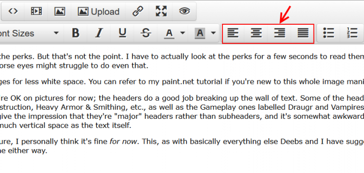 If you click on the photo, then on the leftmost button (align left), the text will wrap to the right of the image. Like so. This effect can be combined with different text wrapping styles. For example, this first paragraph is also under the effect of "align left", and wrapped to the right of the photo. It's the right because the photo is tagged as "align left".