Post-Processing Screenshots in Paint.NET
Hi hi welcome back to soly does Paint.NET tutorials. This is the second such tutorial, and I'm going to talk to you about screenshots in Skyrim. In case you missed it the first tutorial is here (link). All tutorials are also tagged with #soly pdn (link, which will only work when this goes into the Art Group proper) so you can click on that or on the tag which is... at the top of the post.
By now, I'm sure there are other screenshot tutorials dealing with how to take beautiful screenshots (I learned from about three different ones). It involves a lot of console commands and a bit of modding. If there's demand I can write a screenshotting tutorial, too, but there are other tutorials which teach you to take good screenshots so I won't bother for now. Instead, this tutorial is going to focus on that beautiful intersection between screenshots and Paint.NET – that which makes you seem better at screenshotting than you really are. Post-processing!
Let's begin the tutorial, shall we?

Post-processing is... I shan't bother with a dictionary definition – for our purpose, it's basically taking your screenshot, opening it up in Paint.NET and making it look better. Generally we're going to be toying with lighting and contrast and colours, and there are a few different ways to go about it. Most of which I don't know, but I want to share the ones I do know. Which means that in this tutorial you're going to get a good look at something the previous tutorial didn't touch on much – the Adjustments menu.
Let's look at this in a bit more detail. The first thing you need to understand is that, like nearly everything else in Paint.NET, everything in the Adjustments menu works by layer – any adjustments made will only affects the currently selected layer, and not the image as a whole.
Now, when you click on the Adjustments menu, you'll see something like this:
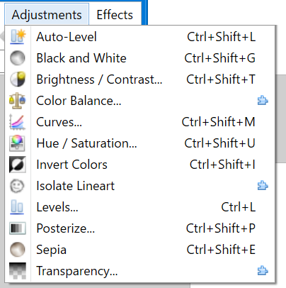
We're going to run down the list, and first up is Auto-Level. It's an automatic operation that sort of balances the lighting colour in a picture. Despite being automatic, it has some fairly impressive outcomes (it can literally turn night to day). And because it's automatic and a single operation, you can basically just throw it out whenever and see what you see. Don't like it? Ctrl+Z. Given the nature of Skyrim screenshots to be pretty dominated by a single lighting colour, Auto-Level is incredibly useful. We'll showcase this tool later on in the tutorial.
I meant it when I said it can literally turn night to day.
Second in the list is Black and White. It's exactly what it sounds like. I never use it. What's the point?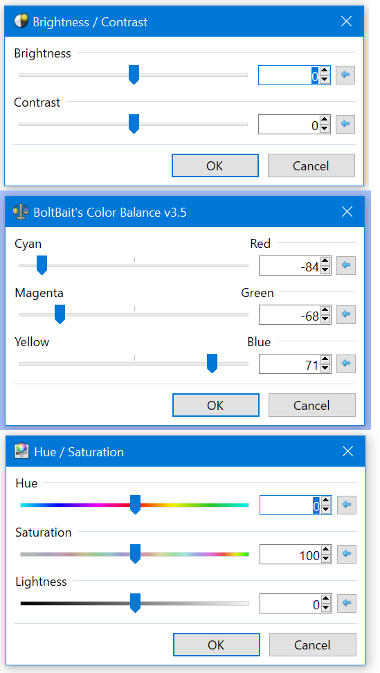
Third, we have Brightness and Contrast. This will call up a window with bar inputs that you can use to... adjust the picture's Brightness and Contrast. Brightness will sort of make the picture brighter, but be aware that it sort of applies a whitish effect on everything. (It's better than the Lightness bar in Hue/Saturation.) Contrast doesn't strictly increase picture contrast – it sort of dials brighter colours towards absolute white and darker colours towards absolute black; at the far right end of the bar the image is comprised of only these two colours. So if you have a My Little Pony image comprised of pastel pinks and baby blues and sunny yellows, don't be surprised if applying Contrast turns the whole thing white. (I tested this, but not with an MLP image.)
These are very hammer-esque tools in that they're not very subtle. That doesn't make this useless – it's a super simple bar input that will suffice for most simple work (which is most of what I'm covering). People better at this than me have suggested that the Brightness/Contrast is generally superseded by Levels and Curves, and while that's probably true, Levels and Curves are also a lot weirder to use.
If you have Boltbait's pack, you'll see Colour Balance next. It's also not very subtle in its effects and also probably generally superseded by the Levels and Curves tools. But much like Brightness and Contrast, this thing is so easy to use – dial up one bar and the entire picture turns more towards that colour. As a general rule, you only use this tool for small adjustments (<10). Any more than that and the colour becomes blindingly obvious, which is bad.
The Curves tool is generally not necessary for simple photo edits, and it is too complex to delve into deeply here. I will include as simple an explanation as I can here, but look out for a future tutorial on this tool.
So if you look at the Curves Tool you'll see something like the left window. Basically what this means is that the "curve" (which will start as a straight line from the bottom left to the top right, as in the left window) maps input colour luminosity (your image before applying curves) to output colour luminosity (your image after the curves are applied). Refer to the red arrows.
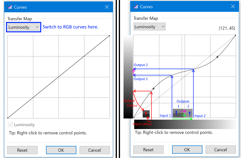
Notably, Curves changes an image's contrast - the more vertical the curve at any one point, the more output range per input range, and therefore the more the contrast. Of course, the total range is still the same, so if you have a more vertical point on the curve (red arrow range) there must be a more horizontal point on the curve with lower contrast (blue arrow range - see how Input 1 and Input 2 differ greatly, compared to Output 1 and Output 2?).
There are also RGB curves which do the same input/output things for the reds, greens and blues in a picture.
This is a pretty complicated tool that a 2-paragraph explanation doesn't really do justice, even with accompanying image. So if you don't quite understand how it works that's fine for now as the rest of the tutorial won't touch on this tool. Either look up Photoshop guides to the tool (they function similarly) or want for the Paint.NET guide that I'll write later.
Sixth on our list is the Hue/Saturation command (not included in name, but still in the command list: Lightness). This one is important to know. Hue changes the colour of a picture along the little slidey scale – so blues turn to pinks to reds to yellows to greens to light blues and to blues again. When you bump the slidey scale to one side, all the colours in the picture shift that way. This is one of the premier ways to make things change colours dramatically in Paint.NET. Since we're not changing colours dramatically, leave the Hue bar alone. If you do need to make dramatic colour changes, boot it up.
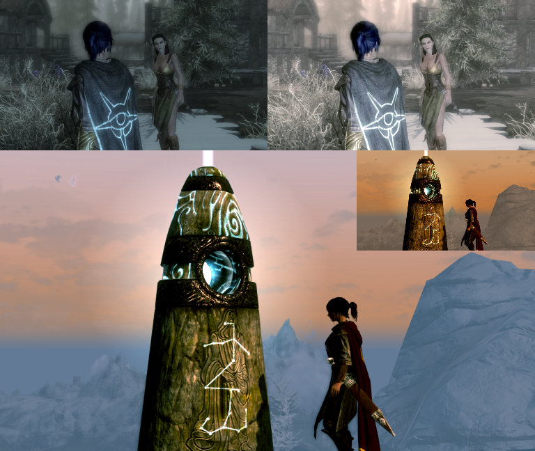
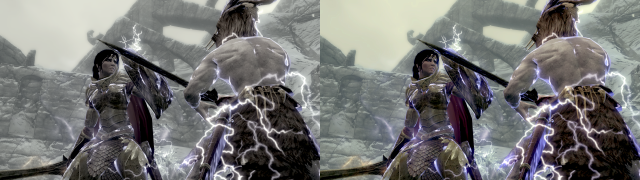
Saturation, on the other hand, is an incredible tool which shifts all colours on the image away from (or towards) the centre of the colour wheel. In less technical terms, colours become more vibrant, pop more, and don't look so washed out. Use your own judgment with the Saturation command - too much can be a bad thing. The image below is Before (left) and After (right) applying Saturation.
Lightness is generally superseded by the Brightness command. It's even more hammer-esque than Brightness, which is an incredible feat – if you dial Lightness up to 100, everything turns white. Generally avoid using this always.
The next item on the list is Invert Colours. Does exactly what it sounds like it does. Good for dramatic things. Generally avoid for serious things. Be aware that it exists here, because sometimes it gets used for weird things.
(I'm skipping Isolate Lineart because it's 1. not a Boltbait plugin, therefore chances are you don't have it, and 2. I don't think I've ever used it.)
Much like Curves, the Levels tool is too complex to go over here in detail. Basically, the Levels window looks like this:
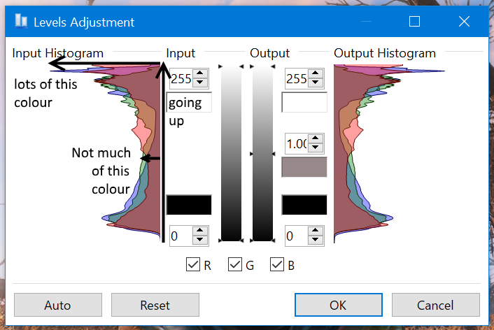
The two funny graphs on the left and right are called histograms and are basically graphs of colours in the image. Going up the histogram tells you the amount of y colour in the image. Going to the side of the histogram tells you how much of that amount of y colour in the image is present. So for this graph in particular, there is a blue spike at the top of the graph. That it's at the top of the graph tells me that there is a lot of blue in this particular colour. That it spikes tells me that there is a lot of space on the image with this high concentration of blue, i.e. the image as a whole should show a lot of bluey space.
There ar five places to fiddle - Input top and bottom, and Output top, middle and bottom. Fiddling with the Input side whites out (or blacks out) any part of the image that you cut under. Fiddling with the ends of the output will compress certain colour shades. And fiddling with the middle point stretches out one half of the histogram and compresses the other half.
Much like Curves there is the RGB option that lets you fiddle with individual RGB histogram levels.
This tool, again like Curves, is really complicated and a two-paragraph explanation cannot do it justice so if you don't understand it from here, that's fine because the rest of the guide won't touch on these. Either look up Photoshop guides to the tool, or wait for me to write the guide to Levels and Curves.
Next up is Sepia. It turns the whole image sepia. I guess if you like making your screenshots look like old photos, you can use it. I personally pretend it doesn't exist.
Finally we have Transparency from the Boltbait plugin pack. This basically changes the degree of transparency of the layer. It's half-superseded by Layer Properties, which also lets you control the transparency of a layer. But this option also allows you to turn transparent pixels more opaque, which can be very handy.
Now that you've familiarised yourself with some of the tools we'll be using, let's jump over to actual screenshot editing.
If you've ever so much as played Skyrim you'll know that it's pretty gorgeous, even vanilla, but when you try to take a screenshot, you'll often find... issues... cropping up. Such as the fact that everything's grey, or everything's dark, or everything's yellow, or the lighting in the room sucks and it's calling attention to the background of the picture rather than the silhouetted subject. (This is not generally an issue with FO4, I think.)
You might recognise this Forsworn picture, look up.In my (not-so-)humble opinion, this picture is gorgeously composed. But let's be frank. It sucks. Look at it. Everything is grey, colourless and underexposed! (For the non-photographers among us, “underexposed” basically means it's badly lit and therefore sort of dark.)
For the purposes of teaching, I'm going to reinvent the wheel and fix this Forsworn pic a third time.
The first thing we're going to do is run it through Auto-Level. This is generally worth doing for images which are pretty greyed-out, overly yellow, or generally have an overabundance of one light colour.
You'll find that it's still a little bit washed out (left picture), so we're going to dial up the picture's Saturation to make the colours pop a bit more (right picture).
Same picture... anyway, at this point I kind of figured it looked fine so I saved it. Simple.
Let's look at another one. I took this screenshot in Shalidor's Maze, and while it'll look about the same to fix, it's actually slightly harder:
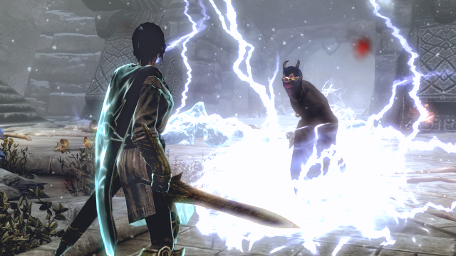
Yes, I forgot to console csb (clear screen blood) so there's an ugly red patch there. Anyway! You'll immediately notice that this image is both rather washed out and underexposed, so as with the Forsworn pic, the first thing I'm going to do is drop Auto-Level on it. I'll then dial up the Saturation to 140 (this sounds high on paper, but recall that the Saturation default is at 100, not 0).
Oh, dear. The background is now approaching properly lit, but it's still a little dark. That's fine, but our image subjects - the player character and the dremora - are rather underexposed. We use the Brightness/Contrast tool and dial up the Brightness to 30. Notably, this is going to lose some of the electric detail that I'm marking in red on the image below.
This is probably mostly unavoidable - you could mark it out with the Lasso tool before applying the increased Brightness, but that comes with its own irritants. Proper use of the Curves tool could probably also retain some of the detail, but I haven't the space here to go into detail on the use of Curves. At any rate the detail loss here is minor anyway so I'm electing to ignore it.
This picture is actually more or less presentable (at least once you cut out the eye-searing bright red... pain, there's precious little you can do about the blood) so you could call it done here. For the purposes of this tutorial though we're going to delve in a little deeper. Specifically, I don't like the loss of detail on the dremora's face due to underexposure. When you're only dealing with a small part of the picture that needs correcting, you have the possibility of Lasso'ing that part and applying Brightness/Contrast (recall that when there is an active selection, any changes made only apply to that selection). The Lasso tool, of course, needs an unreal amount of precision to use, so we're going to do something slightly different.
First, we call up a new layer. On this layer, we select a white (or light-coloured) paintbrush and paint all over the dremora's head (he doesn't care, thankfully, I wouldn't want to tangle with him).
Apply a mid-ranged Gaussian Blur. Use your discretion, here - I've opted for one ar radius 12, but it will be dependent on the size of the image, the size of the white paint, and how round or slim the paint area is.
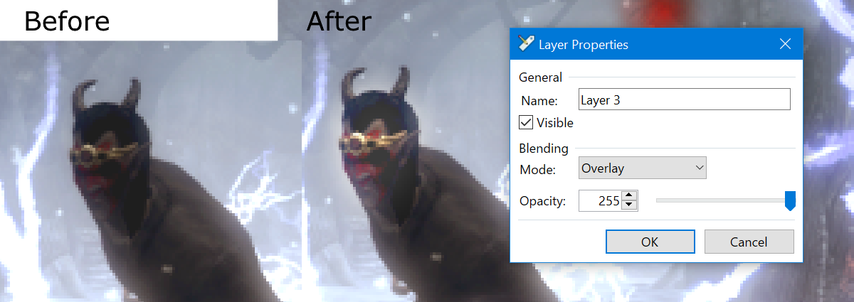
Then open the Layer Properties for the white layer and set it to Overlay. Do also experiment with other Layer Blending Modes (especially Colour Dodge) and opacity levels. But at 255 Opacity with a white paintbrush, the one that's going to work is Overlay. If you're using other colours, play around with various levels of opacity and different Layer Blending Modes and see what you can see. That's important - sometimes you'll get great effects with a light shade of grey and something like Colour Dodge.
Notably also, this technique can be used with dark colours to darken an image (favour the Colour Burn blending mode instead of Colour Dodge). Remember that, it's pretty important!
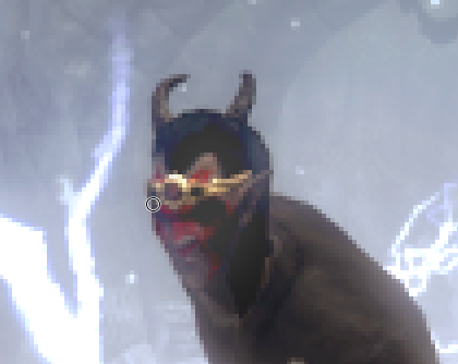
Notice how the details on the dremora's head - red war paint, eye dimples, nose, mouth - are suddenly absolutely visible? Skyrim is nice like that. It preserves details very finely even in the dark.
You'll notice also in the above picture that the dremora's head is now glowing slightly. That would be the effect of the white paint layer, which sort of overextended the dremora's head into the surrounding abckground when the Gaussian Blur was applied. Use a mid-radius, high-hardness Eraser tool (the Eraser radius should be large enough to erase the Gaussian Blur radius, so slightly over 3/4 of the Gaussian Blur radius is large enough) to get rid of most of the glow, then a low-radius, high-hardness one to get the little corners. (Here, I've used radius 10 and 3 respectively.)
I'm applying a similar process to Player Character. She doesn't strictly need it, but it'll probably be an improvement. If not, all the work is done on a separate layer anyway so it's easy to delete if necessary. Gaussian Blur radius used is 15. Notably, in this case I've also dialed down the opacity of the white layer to 128, so the effect is not as noticeable.
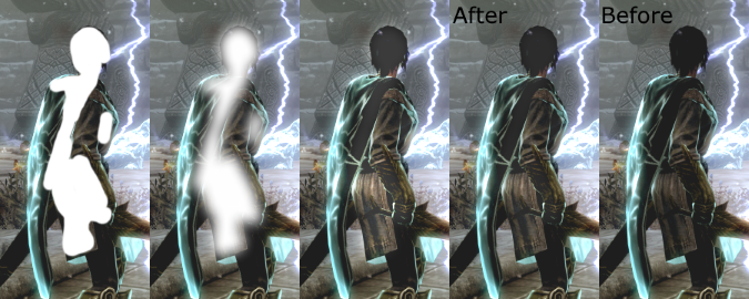
So here is the processed image. I've taken the liberty of adding a subtle Yellow/Blue +5 Colour Balance adjustment to wash out some of the yellows which were dominating the image (the change is most obvious in the top left of the image). Below it is the same image, but with the white paint layers rendered visible and fully opaque.
So to recap - we've added to our arsenal the Auto-Level command, the Brightness and Contrast tool, the Hue/Saturation tool, the Colour Balance option, and this nifty little paintbrush>Gaussian Blur>Overlay/Colour Burn/Colour Dodge technique. Excellent! I'll see you all next time, hopefully.
Post-Processing Screenshots in Paint.NET
Hi hi welcome back to soly does Paint.NET tutorials. This is the second such tutorial, and I'm going to talk to you about screenshots in Skyrim. In case you missed it the first tutorial is here (link). All tutorials are also tagged with #soly pdn (link, which will only work when this goes into the Art Group proper) so you can click on that or on the tag which is... at the top of the post.
By now, I'm sure there are other screenshot tutorials dealing with how to take beautiful screenshots (I learned from about three different ones). It involves a lot of console commands and a bit of modding. If there's demand I can write a screenshotting tutorial, too, but there are other tutorials which teach you to take good screenshots so I won't bother for now. Instead, this tutorial is going to focus on that beautiful intersection between screenshots and Paint.NET – that which makes you seem better at screenshotting than you really are. Post-processing!
Let's begin the tutorial, shall we?
Post-processing is... I shan't bother with a dictionary definition – for our purpose, it's basically taking your screenshot, opening it up in Paint.NET and making it look better. Generally we're going to be toying with lighting and contrast and colours, and there are a few different ways to go about it. Most of which I don't know, but I want to share the ones I do know. Which means that in this tutorial you're going to get a good look at something the previous tutorial didn't touch on much – the Adjustments menu.
Let's look at this in a bit more detail. The first thing you need to understand is that, like nearly everything else in Paint.NET, everything in the Adjustments menu works by layer – any adjustments made will only affects the currently selected layer, and not the image as a whole.
Now, when you click on the Adjustments menu, you'll see something like this:
We're going to run down the list, and first up is Auto-Level. It's an automatic operation that sort of balances the lighting colour in a picture. Despite being automatic, it has some fairly impressive outcomes (it can literally turn night to day). And because it's automatic and a single operation, you can basically just throw it out whenever and see what you see. Don't like it? Ctrl+Z. Given the nature of Skyrim screenshots to be pretty dominated by a single lighting colour, Auto-Level is incredibly useful. We'll showcase this tool later on in the tutorial.
I meant it when I said it can literally turn night to day.
Second in the list is Black and White. It's exactly what it sounds like. I never use it. What's the point?
Third, we have Brightness and Contrast. This will call up a window with bar inputs that you can use to... adjust the picture's Brightness and Contrast. Brightness will sort of make the picture brighter, but be aware that it sort of applies a whitish effect on everything. (It's better than the Lightness bar in Hue/Saturation.) Contrast doesn't strictly increase picture contrast – it sort of dials brighter colours towards absolute white and darker colours towards absolute black; at the far right end of the bar the image is comprised of only these two colours. So if you have a My Little Pony image comprised of pastel pinks and baby blues and sunny yellows, don't be surprised if applying Contrast turns the whole thing white. (I tested this, but not with an MLP image.)
These are very hammer-esque tools in that they're not very subtle. That doesn't make this useless – it's a super simple bar input that will suffice for most simple work (which is most of what I'm covering). People better at this than me have suggested that the Brightness/Contrast is generally superseded by Levels and Curves, and while that's probably true, Levels and Curves are also a lot weirder to use.
If you have Boltbait's pack, you'll see Colour Balance next. It's also not very subtle in its effects and also probably generally superseded by the Levels and Curves tools. But much like Brightness and Contrast, this thing is so easy to use – dial up one bar and the entire picture turns more towards that colour. As a general rule, you only use this tool for small adjustments (<10). Any more than that and the colour becomes blindingly obvious, which is bad.
The Curves tool is generally not necessary for simple photo edits, and it is too complex to delve into deeply here. I will include as simple an explanation as I can here, but look out for a future tutorial on this tool.
So if you look at the Curves Tool you'll see something like the left window. Basically what this means is that the "curve" (which will start as a straight line from the bottom left to the top right, as in the left window) maps input colour luminosity (your image before applying curves) to output colour luminosity (your image after the curves are applied). Refer to the red arrows.
Notably, Curves changes an image's contrast - the more vertical the curve at any one point, the more output range per input range, and therefore the more the contrast. Of course, the total range is still the same, so if you have a more vertical point on the curve (red arrow range) there must be a more horizontal point on the curve with lower contrast (blue arrow range - see how Input 1 and Input 2 differ greatly, compared to Output 1 and Output 2?).
There are also RGB curves which do the same input/output things for the reds, greens and blues in a picture.
This is a pretty complicated tool that a 2-paragraph explanation doesn't really do justice, even with accompanying image. So if you don't quite understand how it works that's fine for now as the rest of the tutorial won't touch on this tool. Either look up Photoshop guides to the tool (they function similarly) or want for the Paint.NET guide that I'll write later.
Sixth on our list is the Hue/Saturation command (not included in name, but still in the command list: Lightness). This one is important to know. Hue changes the colour of a picture along the little slidey scale – so blues turn to pinks to reds to yellows to greens to light blues and to blues again. When you bump the slidey scale to one side, all the colours in the picture shift that way. This is one of the premier ways to make things change colours dramatically in Paint.NET. Since we're not changing colours dramatically, leave the Hue bar alone. If you do need to make dramatic colour changes, boot it up.
Saturation, on the other hand, is an incredible tool which shifts all colours on the image away from (or towards) the centre of the colour wheel. In less technical terms, colours become more vibrant, pop more, and don't look so washed out. Use your own judgment with the Saturation command - too much can be a bad thing. The image below is Before (left) and After (right) applying Saturation.
Lightness is generally superseded by the Brightness command. It's even more hammer-esque than Brightness, which is an incredible feat – if you dial Lightness up to 100, everything turns white. Generally avoid using this always.
The next item on the list is Invert Colours. Does exactly what it sounds like it does. Good for dramatic things. Generally avoid for serious things. Be aware that it exists here, because sometimes it gets used for weird things.
(I'm skipping Isolate Lineart because it's 1. not a Boltbait plugin, therefore chances are you don't have it, and 2. I don't think I've ever used it.)
Much like Curves, the Levels tool is too complex to go over here in detail. Basically, the Levels window looks like this:
The two funny graphs on the left and right are called histograms and are basically graphs of colours in the image. Going up the histogram tells you the amount of y colour in the image. Going to the side of the histogram tells you how much of that amount of y colour in the image is present. So for this graph in particular, there is a blue spike at the top of the graph. That it's at the top of the graph tells me that there is a lot of blue in this particular colour. That it spikes tells me that there is a lot of space on the image with this high concentration of blue, i.e. the image as a whole should show a lot of bluey space.
There ar five places to fiddle - Input top and bottom, and Output top, middle and bottom. Fiddling with the Input side whites out (or blacks out) any part of the image that you cut under. Fiddling with the ends of the output will compress certain colour shades. And fiddling with the middle point stretches out one half of the histogram and compresses the other half.
Much like Curves there is the RGB option that lets you fiddle with individual RGB histogram levels.
This tool, again like Curves, is really complicated and a two-paragraph explanation cannot do it justice so if you don't understand it from here, that's fine because the rest of the guide won't touch on these. Either look up Photoshop guides to the tool, or wait for me to write the guide to Levels and Curves.
Next up is Sepia. It turns the whole image sepia. I guess if you like making your screenshots look like old photos, you can use it. I personally pretend it doesn't exist.
Finally we have Transparency from the Boltbait plugin pack. This basically changes the degree of transparency of the layer. It's half-superseded by Layer Properties, which also lets you control the transparency of a layer. But this option also allows you to turn transparent pixels more opaque, which can be very handy.
Now that you've familiarised yourself with some of the tools we'll be using, let's jump over to actual screenshot editing.
If you've ever so much as played Skyrim you'll know that it's pretty gorgeous, even vanilla, but when you try to take a screenshot, you'll often find... issues... cropping up. Such as the fact that everything's grey, or everything's dark, or everything's yellow, or the lighting in the room sucks and it's calling attention to the background of the picture rather than the silhouetted subject. (This is not generally an issue with FO4, I think.)
You might recognise this Forsworn picture, look up.In my (not-so-)humble opinion, this picture is gorgeously composed. But let's be frank. It sucks. Look at it. Everything is grey, colourless and underexposed! (For the non-photographers among us, “underexposed” basically means it's badly lit and therefore sort of dark.)
For the purposes of teaching, I'm going to reinvent the wheel and fix this Forsworn pic a third time.
The first thing we're going to do is run it through Auto-Level. This is generally worth doing for images which are pretty greyed-out, overly yellow, or generally have an overabundance of one light colour.
You'll find that it's still a little bit washed out (left picture), so we're going to dial up the picture's Saturation to make the colours pop a bit more (right picture).
Same picture... anyway, at this point I kind of figured it looked fine so I saved it. Simple.
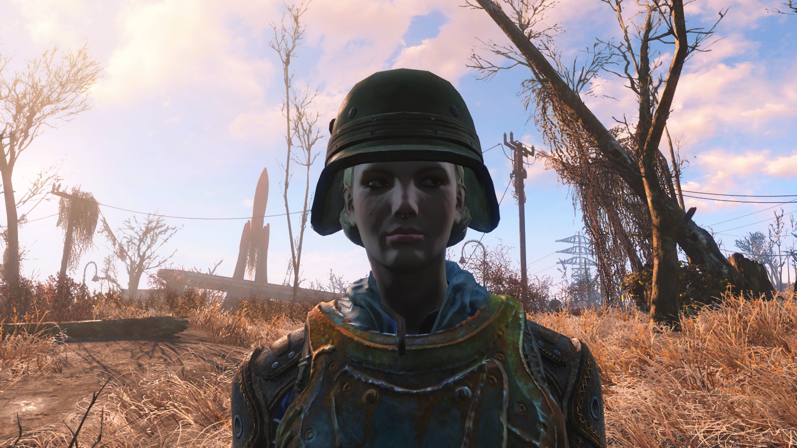
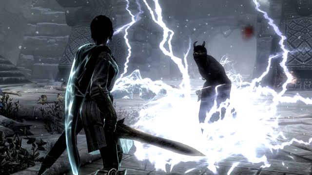
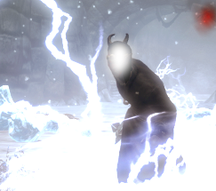
Let's look at another one. I took this screenshot in Shalidor's Maze, and while it'll look about the same to fix, it's actually slightly harder:
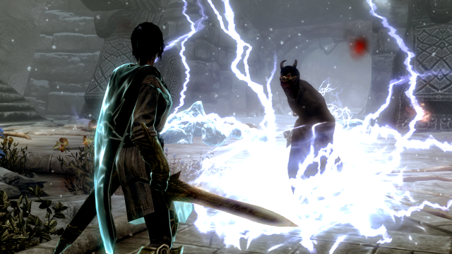
Yes, I forgot to console csb (clear screen blood) so there's an ugly red patch there. Anyway! You'll immediately notice that this image is both rather washed out and underexposed, so as with the Forsworn pic, the first thing I'm going to do is drop Auto-Level on it. I'll then dial up the Saturation to 140 (this sounds high on paper, but recall that the Saturation default is at 100, not 0).
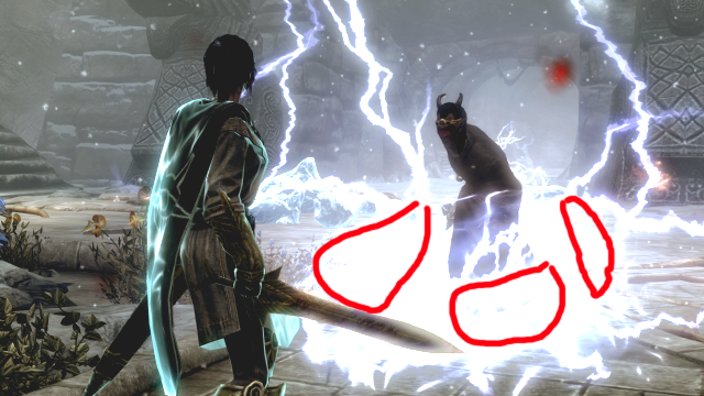
Oh, dear. The background is now approaching properly lit, but it's still a little dark. That's fine, but our image subjects - the player character and the dremora - are rather underexposed. We use the Brightness/Contrast tool and dial up the Brightness to 30. Notably, this is going to lose some of the electric detail that I'm marking in red on the image below.
This is probably mostly unavoidable - you could mark it out with the Lasso tool before applying the increased Brightness, but that comes with its own irritants. Proper use of the Curves tool could probably also retain some of the detail, but I haven't the space here to go into detail on the use of Curves. At any rate the detail loss here is minor anyway so I'm electing to ignore it.
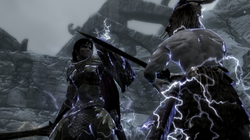
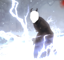
This picture is actually more or less presentable (at least once you cut out the eye-searing bright red... pain, there's precious little you can do about the blood) so you could call it done here. For the purposes of this tutorial though we're going to delve in a little deeper. Specifically, I don't like the loss of detail on the dremora's face due to underexposure. When you're only dealing with a small part of the picture that needs correcting, you have the possibility of Lasso'ing that part and applying Brightness/Contrast (recall that when there is an active selection, any changes made only apply to that selection). The Lasso tool, of course, needs an unreal amount of precision to use, so we're going to do something slightly different.
First, we call up a new layer. On this layer, we select a white (or light-coloured) paintbrush and paint all over the dremora's head (he doesn't care, thankfully, I wouldn't want to tangle with him).
Apply a mid-ranged Gaussian Blur. Use your discretion, here - I've opted for one ar radius 12, but it will be dependent on the size of the image, the size of the white paint, and how round or slim the paint area is.
Then open the Layer Properties for the white layer and set it to Overlay. Do also experiment with other Layer Blending Modes (especially Colour Dodge) and opacity levels. But at 255 Opacity with a white paintbrush, the one that's going to work is Overlay. If you're using other colours, play around with various levels of opacity and different Layer Blending Modes and see what you can see. That's important - sometimes you'll get great effects with a light shade of grey and something like Colour Dodge.
Notably also, this technique can be used with dark colours to darken an image (favour the Colour Burn blending mode instead of Colour Dodge). Remember that, it's pretty important!
Notice how the details on the dremora's head - red war paint, eye dimples, nose, mouth - are suddenly absolutely visible? Skyrim is nice like that. It preserves details very finely even in the dark.
You'll notice also in the above picture that the dremora's head is now glowing slightly. That would be the effect of the white paint layer, which sort of overextended the dremora's head into the surrounding abckground when the Gaussian Blur was applied. Use a mid-radius, high-hardness Eraser tool (the Eraser radius should be large enough to erase the Gaussian Blur radius, so slightly over 3/4 of the Gaussian Blur radius is large enough) to get rid of most of the glow, then a low-radius, high-hardness one to get the little corners. (Here, I've used radius 10 and 3 respectively.)
I'm applying a similar process to Player Character. She doesn't strictly need it, but it'll probably be an improvement. If not, all the work is done on a separate layer anyway so it's easy to delete if necessary. Gaussian Blur radius used is 15. Notably, in this case I've also dialed down the opacity of the white layer to 128, so the effect is not as noticeable.
So here is the processed image. I've taken the liberty of adding a subtle Yellow/Blue +5 Colour Balance adjustment to wash out some of the yellows which were dominating the image (the change is most obvious in the top left of the image). Below it is the same image, but with the white paint layers rendered visible and fully opaque.
So to recap - we've added to our arsenal the Auto-Level command, the Brightness and Contrast tool, the Hue/Saturation tool, the Colour Balance option, and this nifty little paintbrush>Gaussian Blur>Overlay/Colour Burn/Colour Dodge technique. Excellent! I'll see you all next time, hopefully.